Discover invaluable insights from your team’s retrospective data! Use ScatterSpoke’s Team Pulse dashboard to view all of your team’s analytics about team health, retro quality and frequency, improvement ratings and so much more at a glance.
Use Team Pulse to visualize all of your team’s retro data in one place. Behind the scenes, Team Pulse leverages powerful AI to keep track of dynamic data such as:
Accessing the Team Pulse is easy through the ScatterSpoke Main Dashboard. Once you’re in, facilitators can control which teams Team Pulse is pulling data from and within which time period it should be looking. Control your team Pulse visualization by using the options at the top of your screen to see data for some or all teams, within the week, month, quarter or a custom date range.
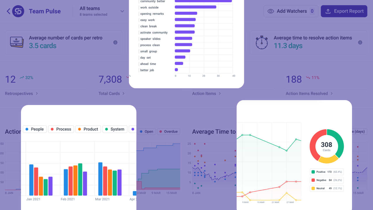
Team Pulse places an emphasis on calculating aggregate metrics such as the Average Number of Cards Per Retro (for the teams selected within the timeframe) to query the level of participation, the Average Time Between Retros to query the frequency of this Agile meetings as well as the Average Time to Resolve Action Items as a way to determine how good the teams are at following through on their next steps.
The dashboard will also compare current participation, frequency and follow through stats to the pervious period (ex. last quarter, last month, or last week) to give leaders a sense of whether the team is generating more or less ideas and actions compared to the previous time frame.
A downward trend can signify retrospective become more rare, ideas getting exhausted or the team’s hesitation to transform their ideas for improvement into actionable takeaways after this Agile meeting.
An upward trend can mean the team or teams are ramping up towards a more frequent retrospective schedule, making improvements to their process practices along the way.
For any team, the most significant outcome of a retrospective meeting are the action items. Without action items, retrospectives become wonderful forums for sharing idea, most of which will not come to fruition. Not ideal. Action items allow teams to configure their ideas and bring new practices into their reality. That is why some of the first statistics the Team Pulse dashboard visualizes are Action Items Over Time depending on their current status (ex. Resolved, Open or Overdue) as well as Average Time to Close Action Items (in days).
Armed with these two stats, team members of leaders can get a sense of whether the team as a unit is moving towards their goals at a steady pace. High resolution times of many action items overdue or open can indicate that the team is deprioritizing actions coming from their retrospectives. Reasons for this can include being pressured by work deadlines, that the team has a workload that is too high or too many work items in progress at once.
We like to think that productive teams are, ultimately, happy teams. Team Pulse’s AI-driven sentiment analysis engine crunches the data about all of the feedback collected from the team during retrospectives that occurred in the timeframe and analyzes the sentiment expressed. The sentiment analysis over time reveals whether feedback in this period was mostly positive, overwhelmingly negative or relatively neutral. Positive, negative and neutral statements are presented as a percentage of the total feedback collected in the period and aggregated in a simple line chart that makes is easy to spot trends over time.
A team that skews in the positive direction is likely a happy team, but might also indicate a team that is afraid of raising tough issues in the dedicated retrospective time.
A team that skews in the negative directions is likely an unhappy team, but that doesn’t necessarily mean that they are demotivated to make changes.
A neutral team is likely a more mature Agile team that has gone through the stages of forming, storming and are now performing as a collective. This team might need a nudge from the retrospective facilitator who can use a new retro format to get them thinking outside of the box again. There are always improvements to be made, no matter how minor!
Tracking **cards by theme **is a powerful resource for team leaders, managers or C-suite to keep an eye on the trending topics inside the teams for which they are accountable. In the Team Pulse dashboard cards by theme area, feedback from retrospective is aggregated and then sorted into 5 key categories: people, process, product, system, tools and tech.
Most cards are analyzed based on their content automatically. However, some cards may be phrased in such a way that they cannot easily be categorized in one of the 5 available buckets. For uncategorized cards, adding tags to feedback manually can help ScatterSpoke’s AI understand where each card falls. You can tag cards manually via the retrospective board where they were created.
As an extra layer of detail to the Sentiment Analysis Over Time measurement, being able to track Sentiment by Theme can be a powerful decision-making tool for leaders and team members alike. Sentiment by Theme sheds light on the specific problem areas that the team is experiencing and show improvements or degradation in the team’s relationship to the people they work with, the process they work within, the product they’re building, the systems they use and the tools & technologies they have access to.
Once the sentiment is analyzed, the number of times specific topics were mentioned can be queried via the Topics module in Team Pulse. This way, leaders can understand what is going on across teams without having access to sensitive information like who contributed the feedback.
If themes are queried by the quarter, Team Pulse can also provide a bar graph that breaks down the number of times the theme was mentioned during retrospectives by month. More frequent mentions of certain categories can give team leads or managers a sense of the conversation without going into the specifics. With a dynamic bar graph visualization, we can determine what our teams are focusing during their meetings, so we can better support them in finding resolution to issues in these categories.
Once again in the name of supporting their teams’ improvement strategies, leaders can keep an eye on the overdue action items at the bottom of their Team Pulse dashboard. Here, they will be able to go into detail about the specific action items that might be giving their teams trouble. By understanding the issues that their teams have delayed solving, leaders can mobilize their resource to help push these lagging action items to completion. While anonymous, this Team Pulse module gives the most insight about the specific questions or concerns the highlighted teams are having in the current period.
Making the Team Pulse dashboard accessible to the right people in the organization is made easy by adding an unlimited amount of Watchers to the dashboard or **Exporting the Report **if you want to share it with someone one-time.
The Team Pulse dashboard inside ScatterSpoke is meant for servant-leaders who want to stay involved in their teams’ process improvement efforts without micromanaging. The anonymized, aggregated data, processed and presented in the Team Pulse Analytics modules is the perfect way to understand the patterns and trends that are developing inside the teams you serve. The visual data modules provide at-a-glance insights about opportunities for support and represent a way to quantify the impact of any decisions you make about the team’s people, process, systems, tools or other components. Seeing how your actions affect the team and supporting them in the actions they are trying to push forward can make the difference between a successful leaders and an absent one.
Start using Team Pulse today!